
Mezzotint Co.
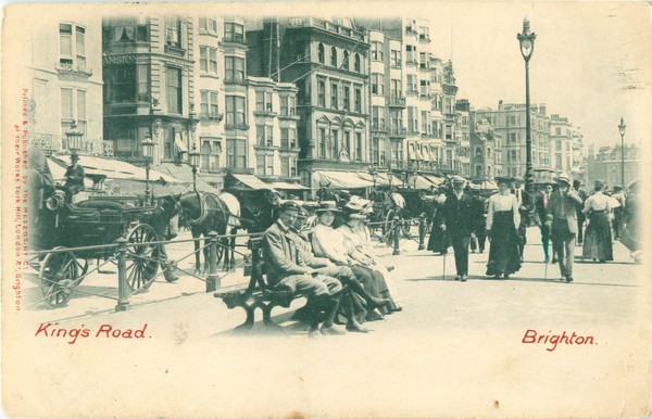
Kings Road, Brighton, junction with Middle Street (undivided back, September 1902 postmark)
Major Brighton publisher of collotype postcards with a printing works at the junction of London Road and York Hill (the postal address was 54a London Road and 35 York Hill or York Road). Many cards are labelled "Mezzotint Compy, York Hill, London Road" or "Mezzotint Co. York Road North. Brighton" (or words to this effect) either on the left of the pictures or on the backs, but some are anonymous, particularly late examples. The backs of most cards are characterised by decorative scrollwork placed under the title "POST CARD". Some backs with scrollwork are printed in red, others in brown or orange. The early cards generally have captions in a gothic font; later examples have more modern looking, non-gothic captions and a small badge or logo on the back of the card.
Mezzotint began issuing cards in 1901 (see John Robards, "The Mezzotint Company. July 1997, Brighton Postcard Club Newsletter, No. 65) and soon enjoyed conspicuous success. It concentrated almost exclusively on collotypes, and some of its early output was of very high quality. Hand coloured versions of some cards were produced, which could be very attractive, but all too often were rather inexpertly done. A common fault, shared with many hand coloured cards marketed by rival publishers, was the addition of fake pink dawns or sunsets regardless of the direction in which the camera was pointed. It is rumoured that prisoners in Lewes Gaol were sometimes employed in colouring Mezzotint cards.
Mezzotint also published occasional real photographics, for example "The grave of William Black" (with no mention of its location), the 5th Royal Sussex Regiment Hassocks Camp in 1911, and a captionless card showing St Aubyn's School at Rottingdean (1913 postmark seen).
Although Mezzotint produced mostly "view" cards, it did record some local events despite the fact that collotype printing had significant start-up costs, which made it ill-suited for quick, short-run productions. Examples are:
- Boer War Peace Day, military salute June 2, 1902 (some cards were issued by S. Hellier)
- Coronation Day, Brighton (August 1902)
- Visit of General French to Brighton, 14 January 1903
- Stockbrokers' walk to Brighton, 1903
- Military camps at Seaford in 1903 and 1905, also Worthing in 1906
- Camps at Scarborough in 1903, Roxburghshire in 1904, Dunmow (Essex) in 1905, & Salisbury Plain in 1905 & 1906
- Stockbrokers walk to Brighton, 1903
- Homecoming of the Duke and Duchess of Norfolk at Arundel, March 5, 1904
- Brighton motor trials, July 1905
- Ruins of the Sussex Pad at Lancing after the fire of October 26, 1905. Another card shows the Inn before the fire
- Unveiling the Royal Sussex Regiment Memorial at Eastbourne on February 7, 1906
- Visit of Princess Alexandra to Bognor on April 4, 1906
- 20th Middlesex Regiment (artists) marching to Brighton, Easter 1906 (on Ashdown Forest, at Falmer etc.)
- After the fire at Preston Old Church, June 28, 1906
- The Handcross bus accident of July 12, 1906
- Sharpshooters, Imperial Yeomanry 1906 (training on a farm at Kemp Town, Brighton)
- Collapse of dock at Southwick, 16 April 1907
- French visitors at Brighton, August 1907
- Lewes Road Congregational Church, Brighton. Laying the foundation stone for a new hall, March 7, 1908
- Soldiers of the East Sussex Regiment marching at Brighton in 1908 and other soldiers in 1908 training at Tarring
- Proclamation of King George V at Brighton in 1910
- Coronation Day at Brighton in 1911 (various cards)
- Kent Brigade Camp, Crowborough, August 1911.
Interesting reminders of former times are a view of the Church at Ditchling "from a photograph taken 50 years ago" and a view of the Old Chain Pier at Brighton, which was destroyed by a storm in December 1896.
Judging from the numbers of postmarks, sales of Mezzotint cards reached a peak in 1905 and then began a long decline. At its peak, the Mezzotint "empire" in Sussex stretched as far north as Balcombe and Three Bridges, east to Maresfield, Groombridge, Uckfield and Hastings, and west to Lodsworth, Arundel and Littlehampton, Selsey and Nutbourne. Mezzotint also produced local view cards of a wide scattering of towns and villages elsewhere in England, such as at Battersea, Bramley, Crowhurst, Horley and Lingfield (Surrey), Ashurst, Shoreham, Warehorne Green, Lydd and Canterbury (Kent), South Benfleet and Great Easton (Essex), Coddington (Nottinghamshire), Bramhall (Cheshire), Rainford (Lancashire), Crookham (Hampshire), Tidworth (Wiltshire), Lifton and Woodbury (Devon) and Addingham (Yorkshire). Cards have even come to light of Pembrokeshire, Glamorgan (Whitchurch), and Cahirciveen in County Kerry, Eire. Most of these non Sussex cards lack a Mezzotint label and in several cases were ostensibly published by local retailers, but have the distinctive scrollwork Mezzotint backs that as far as are known were used by no other publishers.
In addition, Mezzotint recorded Royal visits to Edinburgh in 1905 and 1911, to Cardiff in 1907, Leeds in 1908, Birmingham in July 1909 and Norwich in the same year, as well as the Investiture of the Prince of Wales at Caernarvon in 1911.
It would be interesting to know how the Mezzotint Company came by its name. None of the cards it published were printed using the traditional process known as mezzotint, but before concentrating on postcard production the firm had undertaken general printing, including mezzotint work and lithography. Perhaps it had once sought to specialise in the production of mezzotints.
Brighton Directories from 1908 onwards list James Hamilton as the manager of the Mezzotint Co., but are silent as to who was in charge before this date. According to Kelly's 1905 Sussex Directory, however, the Mezzotint proprietors were "Lane & Ampleton". Many people called Lane lived in Brighton and Hove around this date, but seemingly nobody with the name of Ampleton. Gillian and Paul Bamford, who have made a special study of Mezzotint cards, have discovered that Kelly's were guilty of a misprint and that the Mezzotint proprietors until 1907 were actually a Charles Lane and James Hamilton. They have uncovered two documents in the National Archives, both dating from 1901, that record that Charles Lane and James Hamilton were trading as the Mezzotint Co. and the two partners were the joint copyright owners of two Brighton photographs taken by Charles Lane. They have also uncovered an entry in the London Gazette for April 5, 1907 giving notice that the partnership between Charles Lane and James Hamilton had been dissolved on March 25 by "mutual consent" and that their "late" business, known as the Mezzotint Company, would honour all debts. The implication is that Mezzotint remained solvent, but for some reason the two partners were no longer prepared to work together. Perhaps Charles Lane, who was older than Hamilton, could not agree as to the future development of the firm. Whatever the reason, Hamilton very soon restarted the Mezzotint Company but under his exclusive control. The reconstituted firm continued selling picture postcards, but had to endure an ever-shrinking share of the market, until about 1912, when it ceased trading.
Little is known about Charles Lane. Born at Edenbridge in Kent in 1856, he married Clara Emily Isabella Stone at Brighton in 1877. The couple went on to have three children. When the 1881 census was held, Charles, his wife and first child were living with his widowed mother, Mary Ann Lane, at her home at 76 Upper North Street in Brighton. Also sharing the home was his elder brother Thomas Lane. Charles and Thomas were both described as bicyclists, which may indicate that they were delivery men or messengers. The 1891 census locates Charles and his family at 54 Ditchling Rise in Preston and describes him as a "lithographic printer". In 1901 the Lanes were living at 6 Kensington Place in Brighton. The census notes that Charles was a "collotype printer and lithographer". The 1911 census records that Charles worked on his own account as a "photographer" after his split with Hamilton. He and his family lived for many years at 40 Chester Terrace in Brighton. He is believed to have died at Brighton in 1922, aged 65.
Further research is needed, but there is a strong possibility that the former Mezzotint publisher was the same Charles Lane, who in the First World War and shortly afterwards supplied soldiers serving in Crowborough and Maresfield Army Camps with multi-view cards to send to family and friends. The cards were very different in design to anything Mezzotint had sold, but perhaps Charles Lane had had new ideas that he wanted to try out.
Peter Booth reports that a woman wearing an odd hat with two large "rabbit ears" appears in some Mezzotint photographs of the Patcham area. Almost certainly, this "Mickey Mouse" character was a wife or girlfriend of the photographer, perhaps Violet Hamilton (Clara Lane would have been a little too old for the part). In addition, Gillian and Paul Bamford note that a bicycle with wicker sidecar appears in a number of Mezzotint pictures of Chailey, Maresfield and elsewhere. Perhaps this belonged to Charles Lane.
Although most of the pictures that appeared on Mezzotint cards are likely to have been the work of Lane or Hamilton, in some places Mezzotint relied on local photographers. Several Mezzotint cards of Cowfold, for example, are labelled "Photo, Searle Henfield & Arundel. Likewise, several Mezzotint cards of Henfield use photographs taken by E. L. Merrett, who ran the post office and chemist's shop at Henfield. It was Merrett who provided the photograph for the particularly fine card of 1906 that shows Henfield Fire Brigade. Another local photographer who collaborated with Mezzotint was W.F. Crowther of Mayfield. Several Mezzotint cards of the village are known, which are labelled "W.F. Crowther- Copyright"on the front but have Mezzotint "New Series" backs. In addition to the Mezzotint cards, Crowther sold photographic prints of Mayfield, and also small numbers of his own real photographic cards. Three other photographers who supplied Mezzotint with examples of their work were William Gimson Foster of Brighton (who supplied a view of Alfred Friar's confectionery shop and tea gardens at Bramber), G. F. Burtt of Ringmer (who supplied a selection of local views) and J. Fenner of Partridge Green (who also provided local views).
Mezzotint's sepia tinted collotype of "Old Houses, Tarring" (1911 postmark seen) utilises the same photograph as a coloured collotype entitled "West Tarring, Worthing" that was published by Welch & Sons of Portsmouth and "printed at our works in Belgium" (postally used 1906). One wonders whether Welch took the photograph and then sold it to Mezzotint or whether an anonymous cameraman supplied both firms with the same photograph and thus got paid twice.
Mezzotint were always ready to print cards to customers' specifications, including publicity cards and cards bearing Christmas greetings. A publicity card for the White Horse Hotel in Rottingdean is labelled on the back "L.W. Roberts. Photographer. Brighton". The typography and scrollwork indicate that the card was printed by Mezzotint, although they chose not to include their name. The same is true of cards that Mezzotint produced for Carter Bros. of Western Road, Brighton, and more briefly for Rudolf Handwerck at the Pictorial Centre in Queens Road, Brighton. They also printed cards of Storrington labelled "Published by J. Greenfield & Sons, Storrington" and cards of Fittleworth labelled "Published by H. Rapley, Fittleworth" that have unmistakable Mezzotint backs but do not mention the firm's name. Similarly, at Northiam the local fancy goods and millinery shop sold cards with the name of the proprietors, "Dean & Parker", on the back that Mezzotint must have printed though without including their name.
SEQUENCE OF CARDS
1) The "Undivided Backs". As already mentioned, these appeared in 1901 and continued in use until early in 1903. They are very similar in design to some cards of Brighton issued by Stengel & Co. of Dresden and Berlin. The backs are printed using either black or brownish red ink, and the plainest of serif capitals. By late summer in 1902 the backs of some cards were being labelled "The Mezzotint Series" to the left of the title "Post Card", but this innovation was dropped later in the year.
The pictures on the fronts of cards with undivided backs have a wide, white border at the base and narrower borders at the sides and on the top. The edges of the pictures are often "faded out" and the corners "rounded off". On a few cards the captions are printed in plain black capitals in the top of the border under the pictures, but more commonly they are printed in scarlet or brownish red, either in italics or in the distinctive gothic script that is a feature of a great many Mezzotint cards. Some cards by contrast have handwritten captions in white within the picture space or in black below the pictures. All the cards have the firm's name and address written up the left border alongside the picture, the precise wording varying on different cards.
2) The "First Divided Backs". These were introduced by April 1903. The backs of the cards are printed in black, and the correspondence space is headed "For inland postage only, this space may be used for communication" while the address space is headed "The address only to be written here". Usually, the captions on the fronts of the cards are printed in scarlet in the same gothic script used on some of the cards with undivided backs, and as before the firm's name and address is printed up the left sides of the cards.
3) The "Green Backs". By March 1904 Mezzotint began printing its cards with green linework and lettering on the back, retaining the same the headings as before for the address and correspondence spaces. The captions (if present on the front) are printed in the usual gothic typeface, but usually in dull dark red ("dried blood") rather than in bright scarlet. On a few cards the captions are printed in green on the back. Often, the pictures have no top border and the basal border is narrower than before. The border on the left side is quite narrow or even missing; the right side border is either missing or very wide. The Mezzotint name and address is printed across the pictures at their base or on the left side of either the front or reverse of the cards. Hand coloured versions of some cards were available.
4) The "New Series". By August 1904 cards were introduced with redesigned backs, printed in black, grey or grey green, scarlet or orange. Beneath the title "Post Card" there is some bold decorative scrollwork (earlier cards lacked any scrollwork), while at the top left the words "New Series" are arranged in a discreet ellipse. The headings for the address and correspondence spaces remain the same as on previous divided back cards, but an extra line is used for each heading, and each line is indented. The words "Printed and published by the Mezzotint C,o. Brighton" are printed up the left edge of the backs.
From the front the "New Series" cards look much the same as the "Green Backs", with generally dull red, gothic lettering. The pictures often lack side borders, and on some cards are hand coloured.
5) The "Standard Decorated Backs". By July 1905 the label "New Series" was dropped, and small changes were made to the decorative scrollwork, which had the effect of making it less conspicuous. The rearranged headings for the address and correspondence spaces were retained. Some cards continued to have the firm's name and address written up the left margin on the back (for example, a card of the "Brighton Motor Trials, July 1905), but others were issued anonymously, though the decorative scrollwork makes them instantly recognisable as Mezzotint creations.
Although some cards issued in 1905-6 have handwritten captions (generally in white capitals and superimposed on the pictures), most have printed captions above or beneath the pictures in the dull red gothic typeface that Mezzotint delighted in, with capitals used only at the start of words. On the backs of the cards the lettering and linework are usually in the same dull red used for the captions. Both monochrome and hand coloured versions of some cards were issued, sometimes with the captions changing position from underneath the pictures in one version to on top in the other.
During 1906 some cards were produced with a wide white border to the right of the pictures and captions written sideways up this border. Even more distinctive are some cards with a wide border on all sides of the pictures and a gothic styled caption at the bottom left, which went on sale in 1908. By autumn 1908 the dull red gothic captions began to be replaced by more modern looking plain black captions printed entirely in capitals.
6) The "Black Backs". These cards, which lack scrollwork, are rare and require further research. They were on sale by the summer of 1906, if not earlier, and have delicately coloured collotype pictures with red, non gothic captions. The backs are printed in black, but otherwise resemble those of the "Green Backs".
7) The "Glossy" cards. These were on sale by summer 1911, if not earlier, and are characterised by hand coloured pictures that have been varnished. The gothic typeface for the captions has been dropped in favour of a normal, more modern typeface, and capitals are employed only at the start of words. The backs of the cards retain the decorative scrollwork, but the address and correspondence spaces have no headings. The stamp space is labelled "British Manufacture" and no reference is made to postage rates, in contrast with earlier cards.
8) The "Badged" cards. These have the same backs as the "Standard Decorated Backs" except that the words "British Manufacture" occupy the stamp space (and there is no mention of postage rates) and a lion and crown badge appears to the left of the title "Post Card". The pictures often lack borders and the captions, if present, are printed in normal (non gothic) typeface using capitals throughout or only at the start of words. The cards were on sale by February 1911. Some examples have varnished hand coloured pictures.
Acknowledgement: Grateful thanks are due to Gillian and Paul Bamford for kindly sharing the results of their researches with this website.
To directory of publishersTo gallery
Design: Lucid Design
© www.sussexpostcards.info